Lens: AR App
Bringing your textbooks to reality. An AR learning assistant that turns flat pages into 3D models, videos, and instant explanations — because "just Google it" was never a study plan.
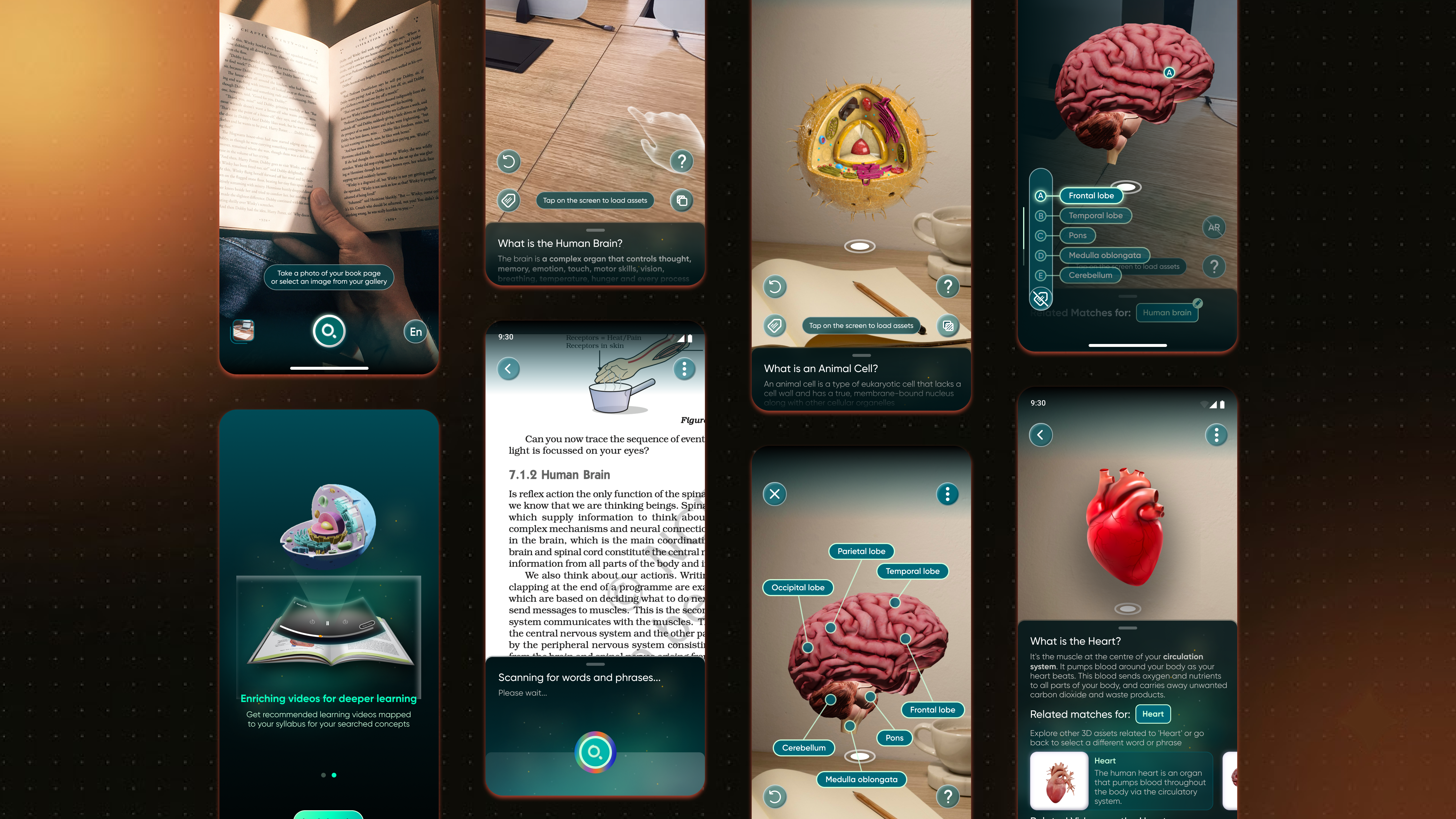
It starts at 11:47 PM.
Picture a 15-year-old, one night before a biology test, staring at the phrase medulla oblongata in a textbook. The textbook, in its infinite wisdom, offers one blurry grayscale diagram and moves on with its life.
So the student does what every student does. Picks up the phone "just to search it." Fourteen minutes later they're three tabs deep into a video about whether octopuses dream. The textbook is still open. The concept is still unlearned. The test is still tomorrow.
This case study is about Lens — an AR learning assistant I designed that flips this ritual on its head. Instead of the student leaving the textbook to find help, the help comes to the textbook. Scan a page, and the app highlights complex terms, then serves up 3D models, videos, and explanations right there, floating in your room.
But before designing anything, I wanted to answer one question honestly: is this a real problem, or just my problem?
The problem, with receipts.
Turns out it's very much a real problem. The research on how students actually experience textbooks and classrooms is… bleak. Here's what the data says.
Students fall off an engagement cliff.
Gallup has been polling students for over a decade, and the pattern is so consistent researchers gave it a name — the student engagement cliff. The longer kids stay in school, the less engaged they become.
Read that again: by high school — exactly when concepts get hardest — the majority of students have mentally checked out. The system asks more of them precisely when it gives them the least reason to care.
Boredom is basically the curriculum.
The textbook has already lost the room.
One study of 262 university students found that only 18% frequently read their textbook before class — and over half admitted to never reading it at all. Students describe textbooks as irrelevant, cumbersome, and boring. The most expensive book they own is functioning as a paperweight with a table of contents.
"I'll just search it real quick" — a tragedy in 15 minutes.
Psychologist Larry Rosen's team observed students during short study sessions, and the results explain every ruined study night ever:
And it's not just at home. In the 2022 PISA assessment, about two-thirds of students reported being distracted by digital devices during math lessons. The phone is where students go for help — and it's also where help goes to die.
Students don't lack information. They lack information that arrives in context, instantly, and in a form their brain actually enjoys — without a detour through the internet's distraction machine.
Four problems, four bets.
I mapped each research-backed pain point to a design bet. Not features for the sake of features — each one exists to close a specific gap.
Students can't picture what a "medulla oblongata" or a "benzene ring" actually looks like. Text alone doesn't build mental models.
Scan the page → get an interactive 3D model you can rotate, zoom, and dissect, placed right on your study desk via AR.
Getting stuck means pausing, searching, filtering junk results, and losing flow — the exact loop Rosen's research shows destroys focus.
The app auto-highlights tricky terms on the scanned page. One tap = explanation, video, and model. No exodus to the browser.
34% are "always bored." Fewer than 2 in 10 find classwork interesting. Flat pages can't compete with everything else on a phone.
Interactive models, virtual lab experiments, and practice modules give the 46% who crave hands-on learning exactly that.
Tutors, smart classes, and coaching are luxuries. A student in a small town has the same textbook, but not the same support.
All you need is the textbook you already own and a basic smartphone. Same quality of explanation for everyone, everywhere.
How I worked.
A classic double-diamond flow — but honestly, the process was less "elegant diagram" and more "loop until it stops being confusing."
Student interviews, empathy mapping, competitive analysis — and reading way too many Gallup reports.
User personas and journeys to turn "students struggle" into which students, struggling where, feeling what.
User flows and information architecture — deciding what happens between "I'm stuck" and "oh, I get it now."
Paper sketches → mid-fi → three full high-fidelity iterations. Each one killed a bad idea from the last.
Talking to actual students.
The published research told me the scale of the problem. Interviews told me the texture of it.
I sat down with a set of school students and asked about their study lives — where they get stuck, what they do next, and what makes them give up. A few of the questions that pulled the best answers:
- ✦"Walk me through the last time you didn't understand something in a textbook. What did you do next?"
- ✦"How engaged do you feel studying from a textbook alone?" (Spoiler: the word "alone" did a lot of work here.)
- ✦"What tools keep you motivated — and which ones just pretend to?"
- ✦"What would make you hesitant to use an AR-based study app regularly?"
What their heads sounded like.
Synthesizing the interviews into an empathy map, four patterns kept repeating:
- "I struggle to understand some concepts from just reading."
- "It takes too long to find good resources when I get stuck."
- "I need something that helps me instantly when I'm studying alone."
- "Am I the only one who finds this difficult?"
- "I wish I could actually visualize this."
- "There has to be a faster way to get help without breaking my flow."
- Pauses study sessions constantly to hunt for videos and explanations.
- Juggles multiple apps and websites for one topic.
- Highlights hard terms… then never comes back to them.
- Frustrated when a concept won't click.
- Anxious about falling behind.
- Genuinely motivated when learning turns visual and interactive.
Notice something? The students independently described the exact loop from Rosen's research — study, get stuck, leave to search, get distracted, feel guilty, repeat. When your interviews and the published data tell the same story, you're probably onto something real.
Who else is trying (and where they stop short).
Plenty of apps orbit this problem. None of them land on it.
The gap: nobody connects the textbook students already study from with instant AR-powered explanations. Everyone builds a new destination; nobody meets students where they already are. That gap became Lens.
Meet Riya and Arjun.
Two personas, distilled from the interviews — one drowning in boredom, one drowning in tabs.
Instant help mid-study, visual tools, something she can use independently without adult supervision.
Hours lost hunting for decent resources; textbooks that feel like they were written to be endured, not read.
Speed, clarity, and tools that make abstract math and science ideas visible; confidence for exam self-study.
App-switching fatigue, information overload, and study methods that move slower than he does.
Different cities, different schools, same core wish: understand it now, here, without the scavenger hunt.
Designing the shortest path from "stuck" to "got it."
Every design decision in Lens was measured against one metric: how many seconds between confusion and clarity?
A few deliberate calls.
Scan a page, upload a photo, or type a search — all three paths converge on the same keyword-selection step. No path is a second-class citizen, because students study in messy, unpredictable ways.
New users pick their exam/board (CBSE, ICSE, state boards, foundation…) so highlighted terms and content match their actual syllabus — not a generic curriculum from nowhere.
Instead of a search bar begging to be typed into, the scanned page itself becomes tappable. The textbook turns into the UI.
Sketches, mistakes, and three rounds of humility.
It started as pen-on-paper wireframes: login, camera permissions, OCR scan view, model viewer with a tags tray. Cheap to draw, cheap to throw away — which is good, because plenty got thrown away.
First high-fidelity pass. Everything on screen at once: scan view, term chips, model previews, action buttons. Testing verdict: visually exciting, cognitively exhausting. Students mid-study don't want a dashboard; they want an answer.
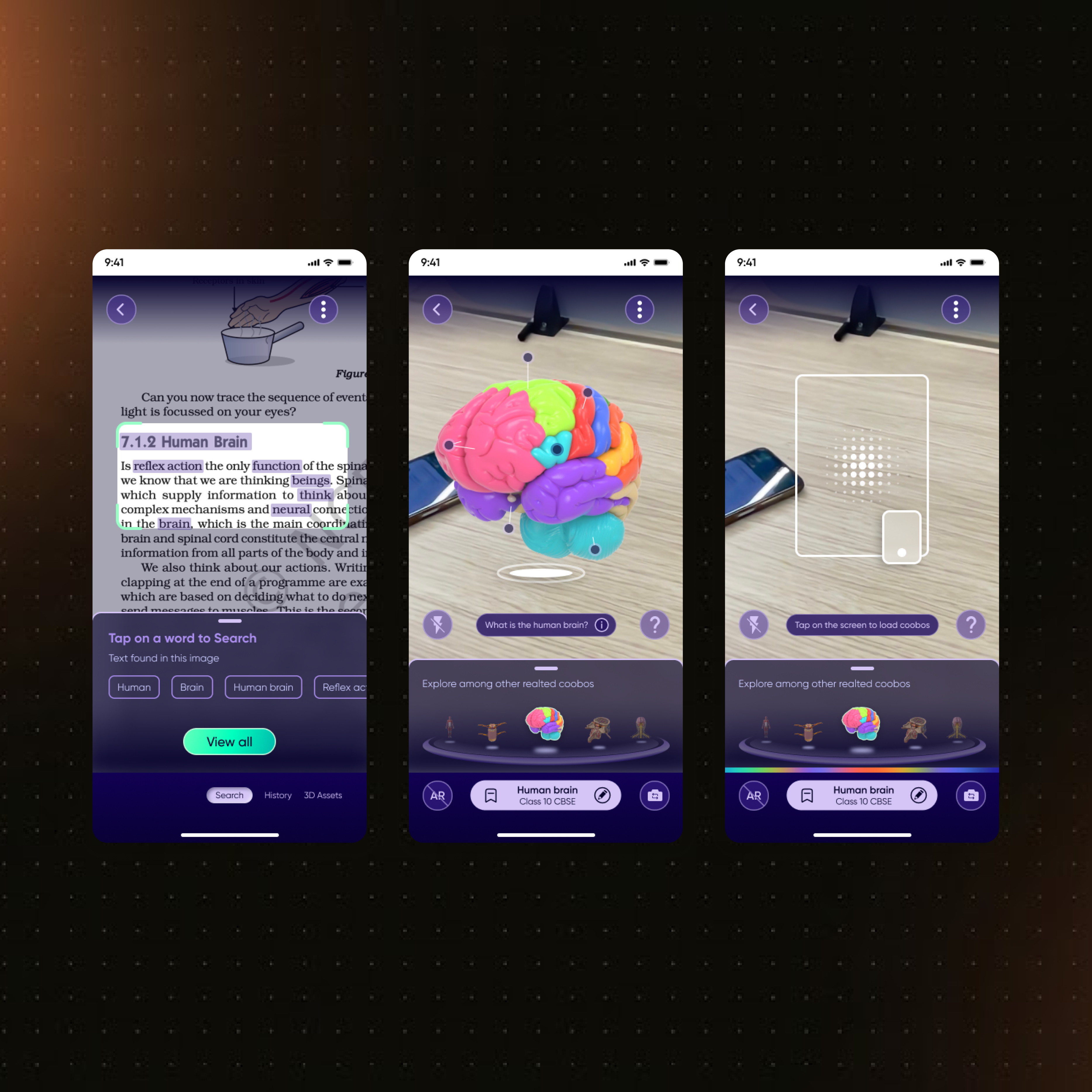
Rebuilt around the scanning moment. The page fills the screen, highlighted terms sit inline, and "Related matches" surface only after a tap. Better — but the AR model view still buried its controls, and users kept missing the video and practice content entirely.
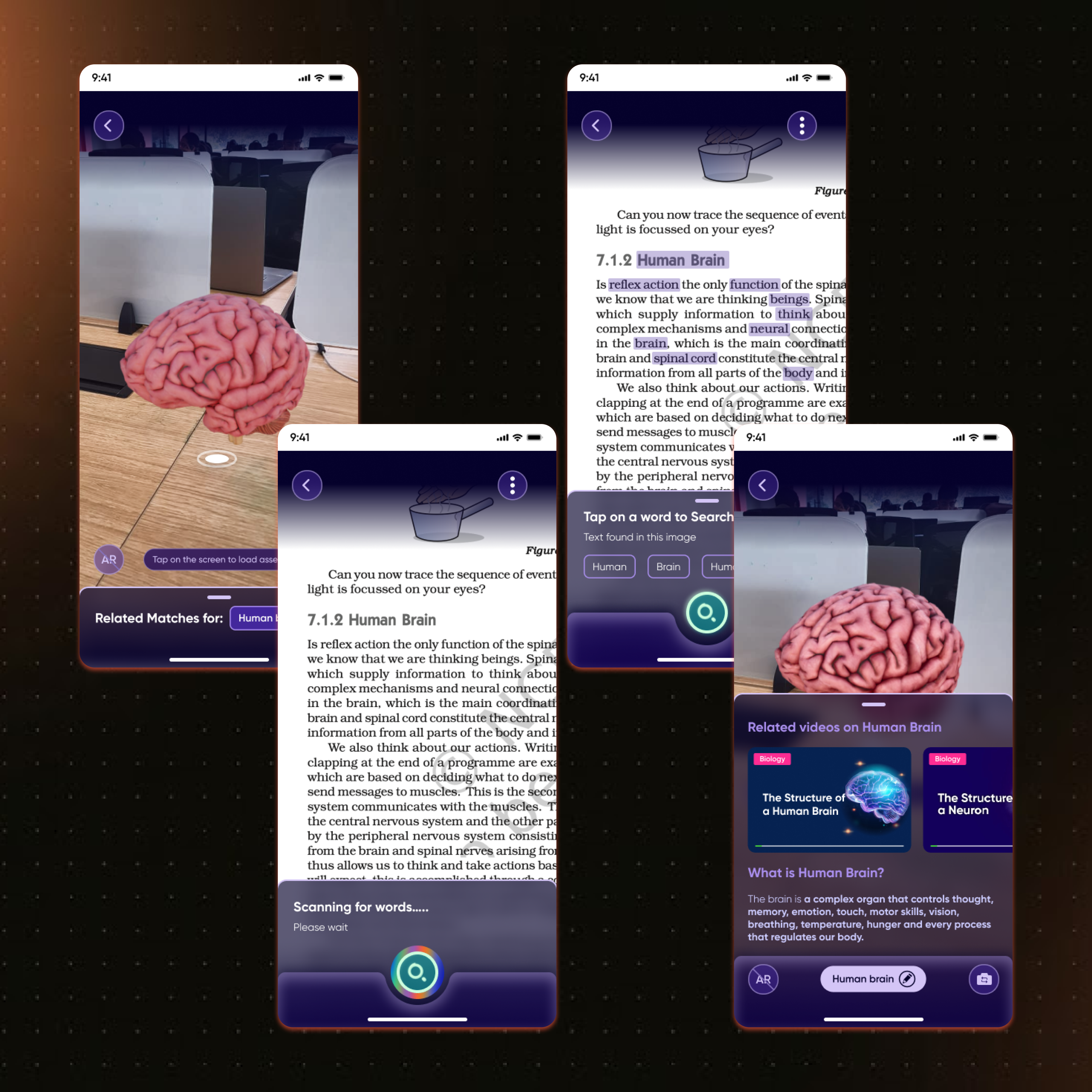
Clear card hierarchy: model first, then a "What is the Human Brain?" explainer, then related videos and practice modules in a scrollable sheet. Added an AR onboarding overlay (rotate with one finger, pinch to zoom) because it turns out nobody reads gestures' minds. This version finally felt calm.
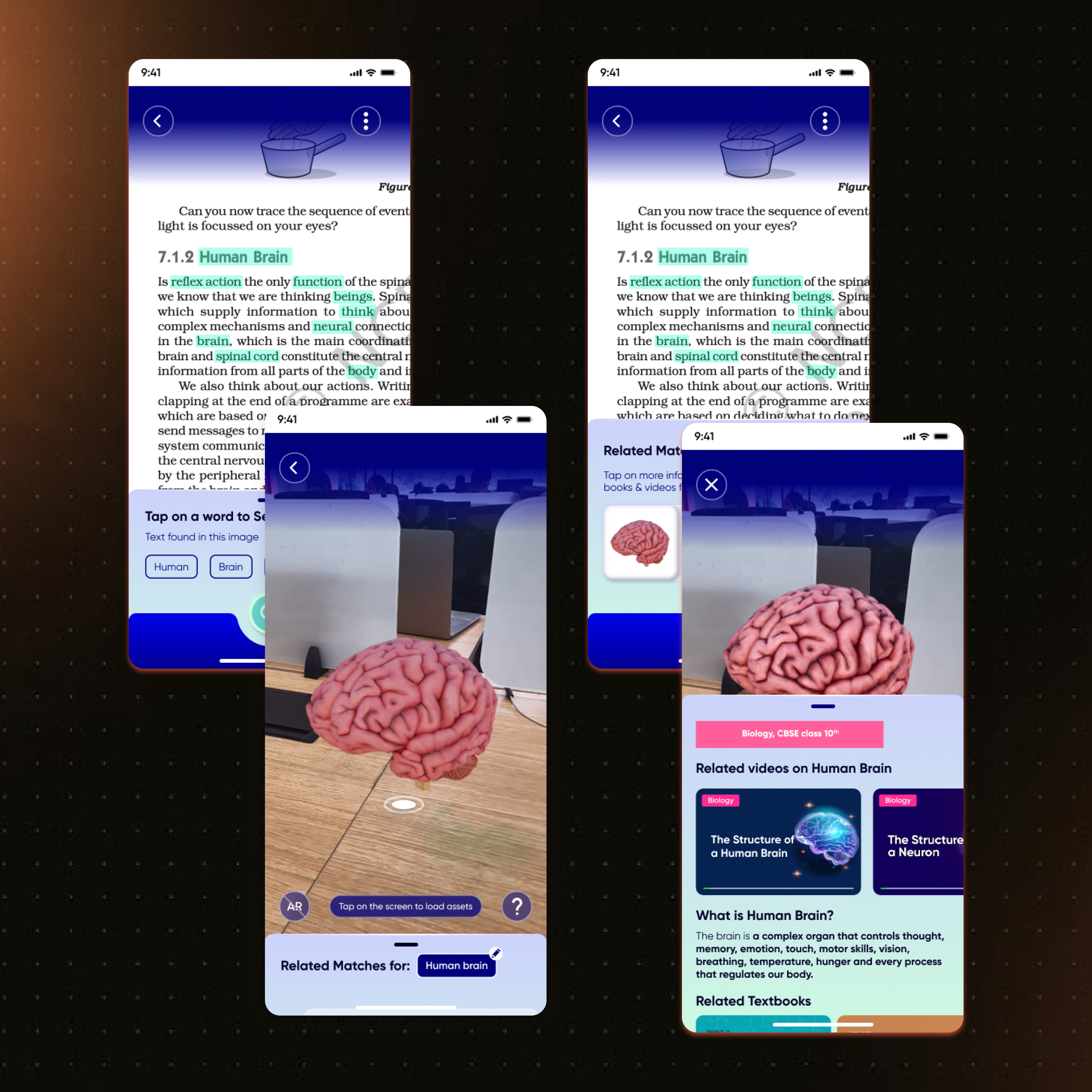
The final product spans 50+ screens: onboarding and goal selection, scan/upload/search flows, OCR highlighting, interactive 3D model viewer with labeled parts, contextual explanations, related videos, practice modules, and virtual lab experiments.
Why AR, and not just another video app.
Fair question — AR could easily be a gimmick with a rendering budget. The research says otherwise.
- ✦ A mixed-method study published in Scientific Reports (Nature) found solid evidence that AR improves students' understanding and recall of concepts — especially intricate, theoretical ideas — by giving them tangible visual representations to interact with.
- ✦ An experimental study with 120 eighth-graders in Saudi Arabia found students' learning retention and critical thinking were measurably better after learning with AR versus before.
- ✦ An AR vocabulary-learning study recorded a statistically significant 12.5% improvement in acquisition (p = 0.03), with 80% of participants finding the AR app easy to navigate.
The theory behind it is constructivism: learning sticks when it's active and constructed, not passively received. A student who rotates a 3D brain, taps the cerebellum, and watches it light up is doing the learning. A student re-reading paragraph four is mostly doing hope.
And remember that Gallup finding — 46% of Gen Z students say hands-on engagement is what drives their interest. AR is the closest a textbook can get to hands-on without a lab.
What happened next.
What this project taught me.
- ✦ Validate the problem before falling in love with the solution. The engagement-cliff data and student interviews pointed at the same wound. AR was the treatment, not the diagnosis.
- ✦ The best interface is the one users already have. Making the textbook itself tappable beat building yet another content library students would have to remember to visit.
- ✦ Interruption is the enemy of learning. Every second saved between "stuck" and "explained" is a second not spent losing focus — the research on distraction made this non-negotiable.
- ✦ Iterate in public, fail in private. Three high-fidelity rounds hurt the ego and saved the product. Iteration 1 me would like a word, but he's not getting one.
- ✦ Accessibility multiplies impact. Designing for a basic smartphone and an existing textbook is why the product could scale from one classroom to state-level education programs.